

The quick answer, all of them and none of them.
Let me guess how you got here.
You opened a new tab, typed "best Squarespace template for coaches" into the search bar, and hit enter with a small, hopeful feeling. Maybe this was the missing piece. Maybe the reason your website has felt so hard is that you simply picked the wrong template, and if you could just find the right one, the one everyone else seems to have found, the whole thing would finally click into place.
So you started reading. And somewhere around the fourth list of "top 20 templates you need," each one prettier and more polished than the last, that hopeful feeling quietly turned into the old familiar one. The one that whispers you're behind. That everyone else knows a secret you don't. That you're about to make the wrong choice before you've even begun.
If that's where you are right now, please know this: it's rarely about not being capable, and it's almost never about the template. More often than not, it comes down to something much simpler, and much kinder, than the internet is letting on.
Let me show you what I mean.
The honest answer nobody selling you a template wants to give.
Here's the truth, and I'd rather you hear it from someone who's on your side than lose another evening to comparison.
On Squarespace 7.1, which is what you'll be building on today, the template matters far, far less than you've been led to believe.
I know that sounds almost too simple. For years, choosing a Squarespace template felt like a high-stakes decision, because on the older version, 7.0, it genuinely was. Different templates had different features baked in. Pick the wrong one and you could find yourself stuck without a feature you needed later, with no easy way to change your mind.
That's not how it works anymore.
On 7.1, every single template shares the exact same features and the same style options. They all sit on the same underlying architecture. What you're actually looking at when you scroll through that dreamy template store isn't twenty different machines with different capabilities. It's twenty different starting layouts for the same machine. Same engine, different paint.
So the template you choose is not a cage. It's a first draft. A suggestion for how your site could look, not a decision you're locked into forever. You can change the fonts, the colors, the sections, the spacing, all of it, without hitting some hidden wall down the road.
Read that again if you need to, because I think it changes everything: you really cannot pick the "wrong" template on 7.1. The thing you've been afraid of getting wrong is mostly a decision you can easily undo.
I'm not telling you this to make the choice feel unimportant. I'm telling you so you can stop treating it like a test you might fail, and start treating it like what it actually is: a comfortable place to begin.
Why “which template is best?" is usually the wrong question.
I want to gently reframe the question you came here with, because I think it's been carrying a weight it was never meant to carry.
When you ask "which template is best for coaches?", what you're really asking, underneath, is something more like: "How do I make sure this looks credible? How do I make sure I don't look like an amateur? How do I make sure this is actually good?"
Those are real questions, and they deserve real answers. But no template can answer them for you, because none of those things live in the template. They live in your clarity.
A gorgeous template filled with vague, unsure copy still reads as unsure. A plain, simple layout filled with words that speak directly to the one person you're meant to serve will outperform it every time. The design is the frame. Your clarity is the picture. And you already have far more of that picture than you're giving yourself credit for.
So before we talk about specific templates at all, I want you to notice the trap, because it's a sneaky one. Spending three weeks choosing between two templates that are, functionally, identical is not building your website. It feels productive. It looks like progress. But it's often just a very tidy way of putting off the part that actually matters, the part where you have to say what you do and who it's for.
You don't need the perfect template. You need a good-enough starting point and the permission to begin. Let's get you both.
How to actually choose, in about the time it takes to make a coffee.
Here's a simple way through, so you're deciding from clarity instead of from that low hum of "what if I get it wrong."
Start with the feeling, not the features. Since the features are all the same, the only real thing you're choosing is the vibe of the starting layout. So ask yourself one question: when someone lands on my site, how do I want them to feel in the first three seconds? Calm and reassured? Warm and welcomed? Quietly confident that they're in good hands? Pick the template whose starting layout already feels closest to that. You're not choosing a toolbox. You're choosing a mood board you happen to be able to edit.
Choose the layout that matches how you actually sell. A coach who books discovery calls needs different things on the page than a maker who sells products. Look at how each template arranges its home page. Does it lead with a clear invitation to work with you, or does it lead with a shop? Pick the one whose default structure already points toward the action you want people to take, so you're editing with the layout instead of fighting it.
Gently resist the template made for your exact industry. This one is a little counterintuitive, so stay with me. When you tell Squarespace you're a wellness coach, it will helpfully steer you toward templates already dressed up for wellness coaches. Its heart is in the right place. But here's the quiet problem: so is everyone else being pointed down that same path. Pick the ready-made "wellness coach" template and there's a good chance your site ends up looking like every other wellness coach who was nudged toward it, all of you wearing the same outfit to the same party without realizing. You don't want to blend into the crowd you're trying to stand out from. So more often than not, you're better off starting with a layout built for a slightly different world, one whose structure you like, and then making it unmistakably yours through your own branding, colors, and imagery. Same reliable bones, a look that's actually you. Remember, on 7.1 the template is only a starting point, which means borrowing a layout from outside your niche costs you nothing and quietly sets you apart.
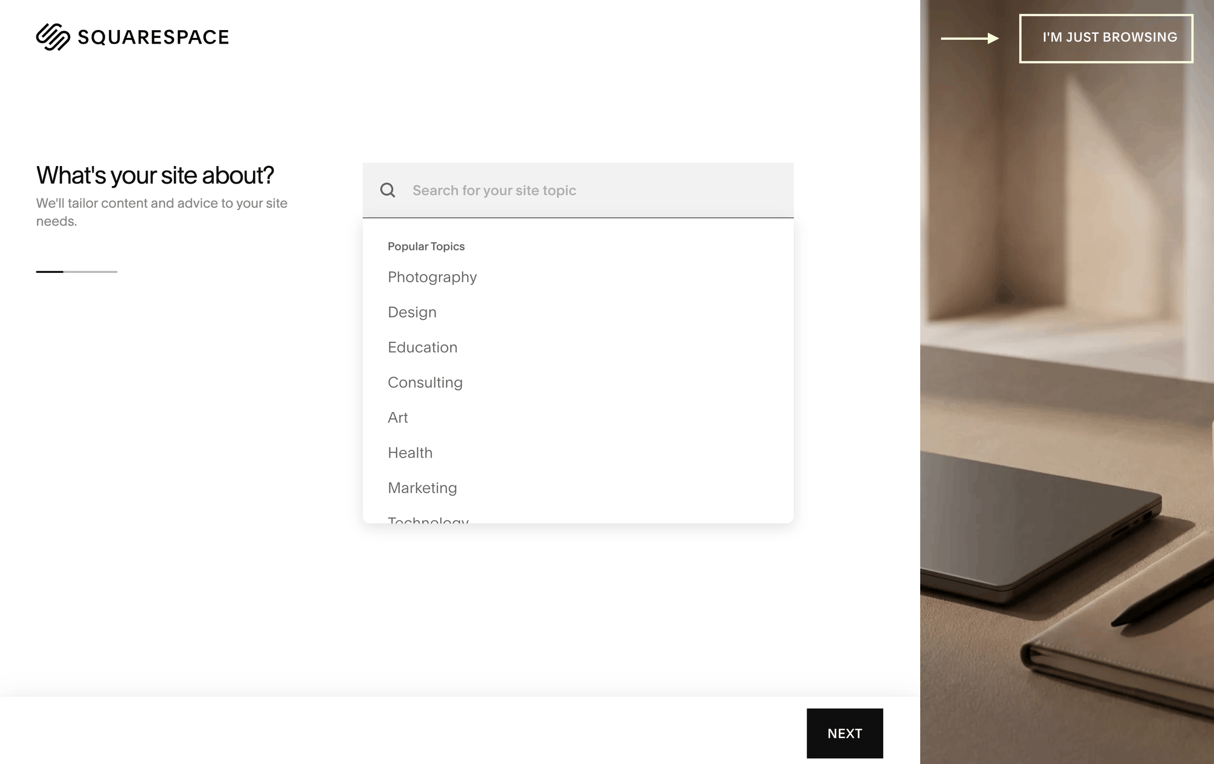
Here's the little trick to see everything. When you start a new site, and Squarespace asks what industry you're in, don't pick one. Choose the "I'm just browsing" option instead. Then, once you're in, select "All templates" from the sidebar. That simple move opens up the widest possible selection, so you're choosing from the full range rather than the narrow slice Squarespace guessed you'd want. And when a template catches your eye, click into it and view the site demo before you decide. The thumbnail only shows you the front door. The demo lets you peek through the window, so you can see how the inside feels too, not just the home page.
Favor simple and spacious over busy and clever. I know the maximalist, animation-heavy templates are tempting. They look like the sites of people who've "made it." But the truth is a clean, uncluttered layout is easier for you to edit, easier for your reader to understand, and reads as more trustworthy, not less. You don't need a loud website to be taken seriously. You need a clear one.
Then stop looking. Genuinely. Once you've found one that feels close, close every other tab. You are not choosing a spouse. You're choosing where to start.
The templates I'd point a coach or female founder toward.
Because I know it helps to have somewhere concrete to begin, here are a few starting layouts that tend to fit the women I work with. Not because they're magic, but because their default structure already leans warm, grounded, and calm, which means less fighting the design to make it feel like you.
Organic Matter is my pick if simplicity is what makes you feel calm. It's very minimalist, which means less to fuss over and less to hide behind. Your words and your work get room to breathe. If you tend to over-tweak, this is a lovely place to start because there's beautifully little to over-tweak.
Kusa is beautiful and bold, and it really shines if you have access to good photography, whether that's professional brand photos or a small collection of images you genuinely love. It's the one to reach for when your visuals are strong enough to carry the page.
Pulaski is the one I'd point you toward if you're a words person. It's built to hold larger amounts of text and longer descriptions with minimal imagery, so if you'd rather explain your work in full than lean on lots of photos, this layout won't fight you for it.
Mycelium is a great option if you have your heart set on something with a lot of gentle movement effects without the layout ever feeling busy or hard to follow. It gives a feeling of floating with a very simple, clear, easy-to-follow structure, though it may be a bit challenging for a true beginner.
Beyond Squarespace's own built-in options, there's a whole world of paid designer templates too, from makers like Big Cat Creative and others, with names like Clarity Coaching built specifically around the way a coach actually sells: a clear sales page, a booking page, a lead magnet page, all mapped out for you. These can absolutely be worth it if the structure saves you time and second-guessing. Just remember the same truth applies. You're buying a head start on a layout and copy prompts, not a feature the free ones lack (unless they use custom code or plugins).
And one more option worth knowing about, in case it's a better fit for how your brain works: Squarespace now has its own AI builder called Blueprint AI. If you already have a really clear vision of what you want, the pages you need, the feeling, and the structure, it can generate a starting site for you based on a few answers, rather than you scrolling through templates at all. I'd offer one gentle caveat, in keeping with everything above. Blueprint AI works best because you're clear, not instead of you being clear. If you're still fuzzy on who you're talking to and what you're offering, no builder can fill that in for you. But if the picture in your head is already sharp, it can be a genuinely lovely shortcut to a first draft you then make your own.
Here's my honest, grounded advice on all of them: any of these will work. Pick the one that makes your shoulders drop a little when you look at it, and move on.
The magic is never going to be in the template. It is always going to be in what you have to offer.
What actually makes a coaching website work.
Since we've taken the pressure off the template, let me put your energy where it will genuinely pay off. If you gave the next few hours to these things instead of to template comparison, your site would be miles ahead of most:
One clear message, aimed at one real person. Not "everyone who wants to feel better." The one woman you picture when you imagine your best client. Write to her. When she reads your homepage, she should feel like you reached through the screen and described her own quiet thoughts back to her.
Copy that sounds like you, in plain language. No jargon, no trying to sound like a corporate brochure. If you'd never say a sentence out loud to a friend across a coffee table, don't put it on your website. The women who are right for you are looking for a real human, not a polished stranger.
A single, obvious next step. One clear invitation. Book a call. Download the guide. Send a message. When you give someone three different things to do, they usually do none of them. Decide the one action you want, and make it the easiest thing on the page.
Enough proof to feel real. It’s about building trust, not bragging. A few honest words from someone you've helped will do more than the fanciest animation on the market.
Give yourself some grace, then give yourself a start line.
I want to name the thing that's really going on when we get stuck on template choice, because I've seen it so many times, and I've felt it myself.
It's rarely about the template. It's about the fear that lives underneath it. The worry that you're not techy enough. That you've been out of things too long. That everyone else has it figured out and you're the only one fumbling in the dark at 11pm, wondering if you're allowed to want this at all.
You are allowed. And the fumbling isn't proof you can't do this. It's just proof that you're doing something new, which is a completely different thing.
So here's your permission slip, from me to you: you don't need to find the perfect template. You need to pick a good-enough one, today, and let it be a beginning instead of a verdict. Progress beats perfection every single time, and one imperfect step you actually take will always outrun the flawless plan that never leaves your head.
Pick your starting layout. Close the other tabs. Then go and write one true sentence about who you help and how. That's the work. That's the whole game. And it's entirely within reach for you, right now, exactly as capable as you already are.
When you're ready for more guidance.
If reading this made you think "okay, I get it, but I'd still love someone to walk me through the actual building part," that's exactly what The Confident Creators Studio is for.
It's my build-with-me program for women who want to create their own Squarespace site, with guidance, in the small pockets of time that are genuinely theirs. Not done for you, so you never get that hollow "did I really do this?" feeling, and not left completely alone either. Somewhere right in the middle, where I'm beside you the whole way, helping you turn your clarity into a website you're genuinely proud of. One that sounds like you, brings in real enquiries, and proves, once and for all, that you absolutely have what it takes.
The template was never the thing standing between you and that. It was just the first small door. And you're more than ready to walk through it.