

Why clarity beats complexity in website design.
When it comes to website design, clarity always wins. A clear, focused website helps visitors instantly understand who you are, what you offer, and how to take the next step.
Think about the last time you landed on a cluttered website. Maybe there were too many colors, too many buttons, or too many messages competing for your attention. It probably felt overwhelming, right? Now think about visiting a site like Apple or Squarespace. Everything feels clean, intentional, and easy to navigate. You know exactly where to look and what to do next. That’s the power of clarity.
Clarity isn’t about being boring. It’s about being purposeful. It’s about creating space for your message to shine.
The psychology of clarity.
Clarity builds trust. It tells your visitors that you’re professional, thoughtful, and reliable. It also reduces decision fatigue, making it easier for people to take action.
Apple is a perfect example. Their product pages are simple and focused. Each section has one clear message, supported by beautiful imagery and minimal text. You’re never overwhelmed, just gently guided through the experience.
When your website feels calm and easy to use, people stay longer, trust you more, and are far more likely to take the next step.
The hidden cost of complexity.
Complexity might look impressive at first, but it often backfires. Too many design elements, colors, or competing messages create confusion. Visitors don’t know where to look or what to do, so they leave.
Even the most talented business owners can fall into this trap, thinking that more design equals more value. But in reality, complexity can make your brand feel chaotic or inconsistent.
Take Everlane, for example. Their minimalist design feels effortless and trustworthy. Every element has a purpose. Their simplicity communicates confidence and quality. No distractions, no noise.
When you strip away the unnecessary, your message becomes stronger.
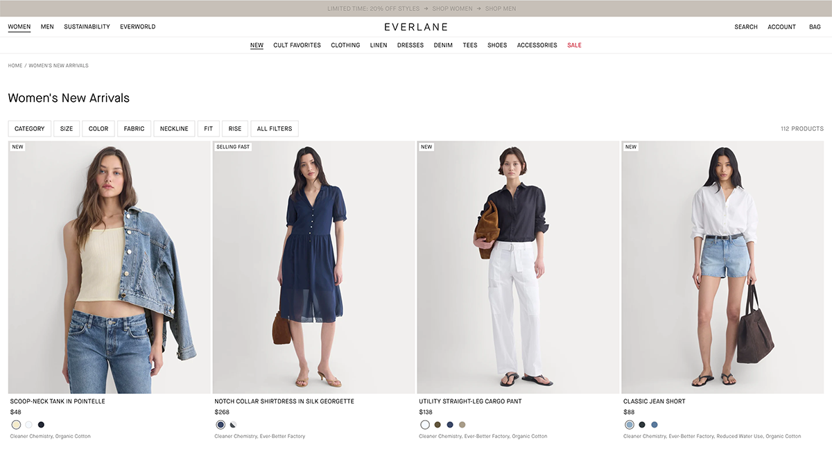
© everlane.com
How to design for clarity
Here’s how to bring clarity into your website design:
Simplify your navigation. Keep your main menu 3–6 items max. Group related pages under clear categories and keep any secondary navigation in the footer.
Use whitespace intentionally. It gives your content room to breathe and helps guide the eye.
Focus on one message per page. Each page should have a single purpose.
Use consistent fonts and colors. Consistency builds recognition and trust.
Guide visitors with clear calls to action. Tell them exactly what to do next, “Book a call,” “Download the guide,” or “View services.”
Clarity doesn’t mean boring. It means confident.
Real-world example: Squarespace’s simplicity.
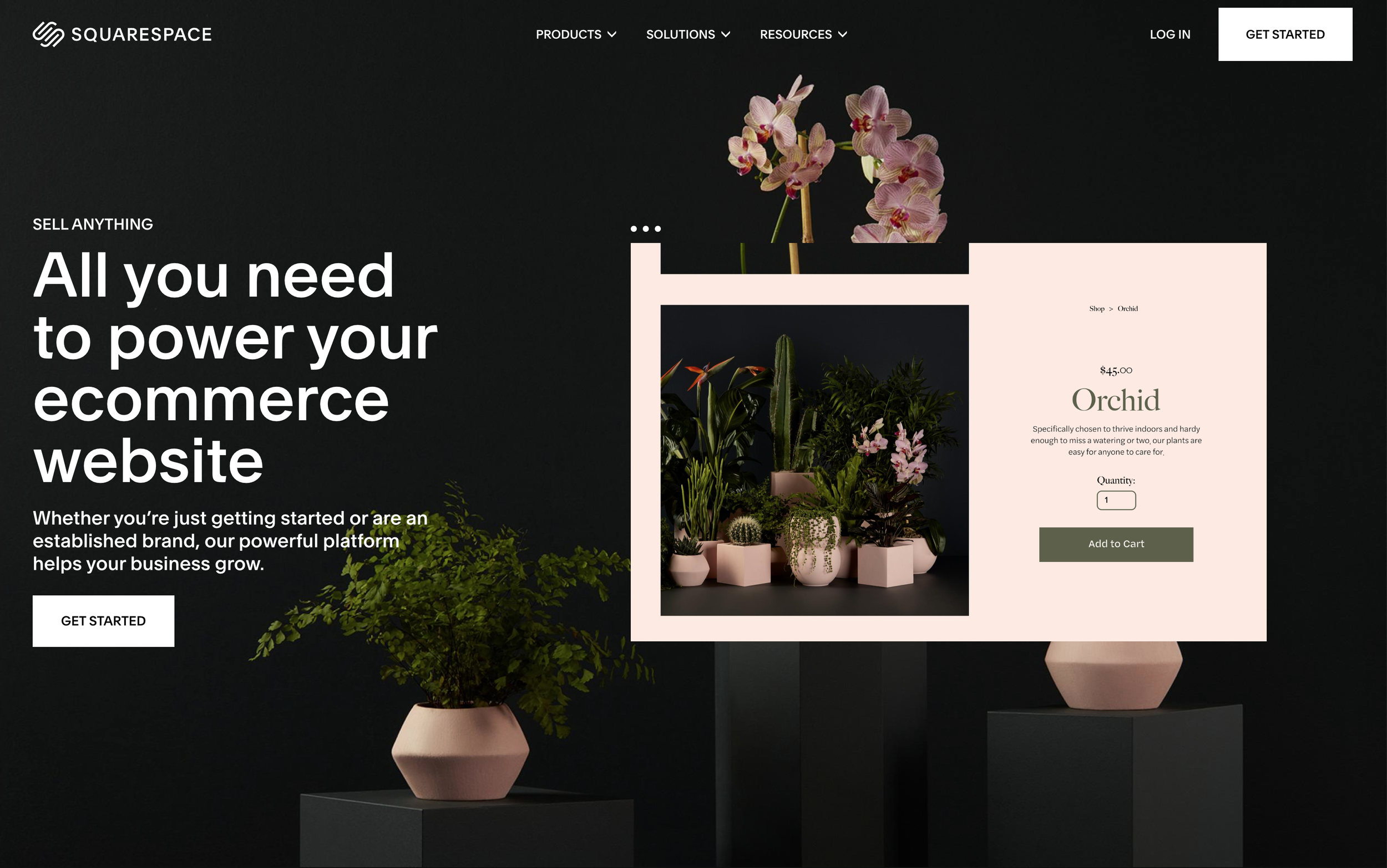
© squarespace.com
Squarespace is a brilliant example of clarity in action. Their own website is clean, intuitive, and beautifully structured. The navigation is simple, the copy is concise, and the visuals are intentional and cohesive.
This clarity helps users feel supported and in control. They know exactly what to expect, and that builds trust.
When your website feels this clear, your visitors can focus on what truly matters: your message, your offer, and your story.
Bringing It All Together
Clarity is what turns a good website into a great one. It builds trust, confidence, and connection. It helps your audience feel calm and guided, not overwhelmed.
You don’t need to overcomplicate your design to look professional. You just need to be intentional.
If your website feels cluttered or confusing, it’s not your fault, it just needs a little clarity. Get a free copy of my Clarity Workbook, designed to help you break through the chaos. And if you’re looking for professional guidance building a strategic website that feels aligned and converts beautifully, explore my Guided Website Design Services.
