United Quilt Guild
Custom Membership Website
The Client
United Quilt Guild is an active, established quilting community with a long history, a dedicated membership, and a calendar full of life. Monthly meetings, classes, a rich archive of past gatherings, and a flagship biennial quilt show that draws attention well beyond the membership itself.
The guild is real, thriving, and full of passionate women who care deeply about their craft and their community. Their website, unfortunately, told a very different story.
The Problem
The site wasn't just outdated. It was broken.
Over the years, successive waves of well-meaning volunteers had done their best to keep it running, adding pages here, updating content there, and patching problems as they surfaced. The result was a website that had grown into something unmanageable: malfunctioning features, failing pages, buried content, and a structure that had long since stopped making sense to anyone trying to use it.
Members couldn't reliably find what they needed. The guild's legacy and quality weren't reflected anywhere on the page. Event information had no clear home. The archive (years of gatherings, shows, and community history) was disorganized and difficult to access. And every time something broke, another volunteer had to step in and try to fix it, usually making things a little worse in the process.
For an organization with such a rich history and this much going on, it was the wrong kind of invisible.
The Goal
United Quilt Guild needed more than a redesign. They needed a complete rebuild. One that would finally give their members a reliable, organized place to find everything they needed, while also presenting the guild professionally to the public and prospective members.
The primary job of the new website was to serve existing members: giving them frictionless access to events, resources, and the guild's archive without frustration. The secondary job was to open a welcoming front door to anyone curious about joining and to give the biennial quilt show the prominent, dedicated presence it deserved.
But running underneath all of that was a third, equally important goal: build something that the next volunteer could actually maintain without breaking it.
The Audience
This project had a defining constraint that shaped every single decision from architecture to typography to the words on the navigation bar.
The members of United Quilt Guild are primarily women between 60 and 80 years old. Many of them are not comfortable with technology, and they shouldn't have to be. They come to the website to find out when the next meeting is, to look up a resource, to browse photos from a past gathering, or to share information about the quilt show with a friend. They are not looking for a puzzle to solve.
Designing for this audience wasn't a secondary consideration — it was the lens through which every choice was filtered. If a member couldn't find what she was looking for on her own, the design had failed, regardless of how good it looked.
My Process
Discovery & Strategy: We started with a deep-dive questionnaire and website strategy session to understand the guild's priorities, the needs of their membership, and what the site was actually supposed to accomplish. With an organization this multifaceted (events, resources, archives, public promotion, and member recruitment all living under one roof) getting alignment on priorities early was essential.
Content Audit: Before anything could be built, we had to reckon with what existed. That meant going through the old broken site, identifying what content needed to be migrated or recreated, what could be consolidated, and what had simply outlived its usefulness. Years of accumulated content don't organize themselves.
Content Priority Alignment: Getting a volunteer-led membership organization to agree on what matters most, and in what order, is its own kind of project. This step required patience, clear facilitation, and a willingness to have honest conversations about what the site could realistically do well versus what it was trying to do for everyone at once.
Site Architecture: With priorities established, I mapped out a site structure that could hold everything — events, member resources, the archive and gallery, quilt show promotion, and new member information — without overwhelming anyone landing on it. Every section was given a defined purpose, a clear location, and a predictable home.
The Strategic Challenges
Most website projects have one central challenge. This one had four, all running at the same time.
Making it maintainable for volunteers: The people updating this site after handoff would not be web designers. They would be guild members who love quilting and are doing their best with technology. The site needed to be structured so that routine updates, adding an event, uploading photos, and posting a newsletter, could happen without the risk of accidentally dismantling the design. Squarespace was the right platform here precisely because of this: its built-in editor lets volunteers update content in plain, visual terms without touching a single line of code or layout setting.
Beyond the platform, the site's architecture was deliberately simplified so that updates only happen in predictable, contained areas. A clear style guide and a set of volunteer maintenance instructions were delivered alongside the finished site, so that whoever took over next has a roadmap, not a mystery.
Organizing years of accumulated content: The archive and gallery alone represented years of gatherings, shows, and community history. That content had value — real value, to real members who wanted to access it — but it was scattered and unsearchable. Creating a logical organizational system for the archive wasn't just a UX task; it was an act of preservation. The goal was to make the guild's history browsable and findable, not just technically present.
Serving two distinct audiences at once: Existing members needed a utility-first experience: clear navigation, fast access to the things they use regularly, and no friction between them and what they came to find. Prospective members and the public needed something different. A compelling, welcoming front door that communicated what the guild was about and made joining feel easy and worthwhile. Both audiences needed to feel at home. Neither could be an afterthought.
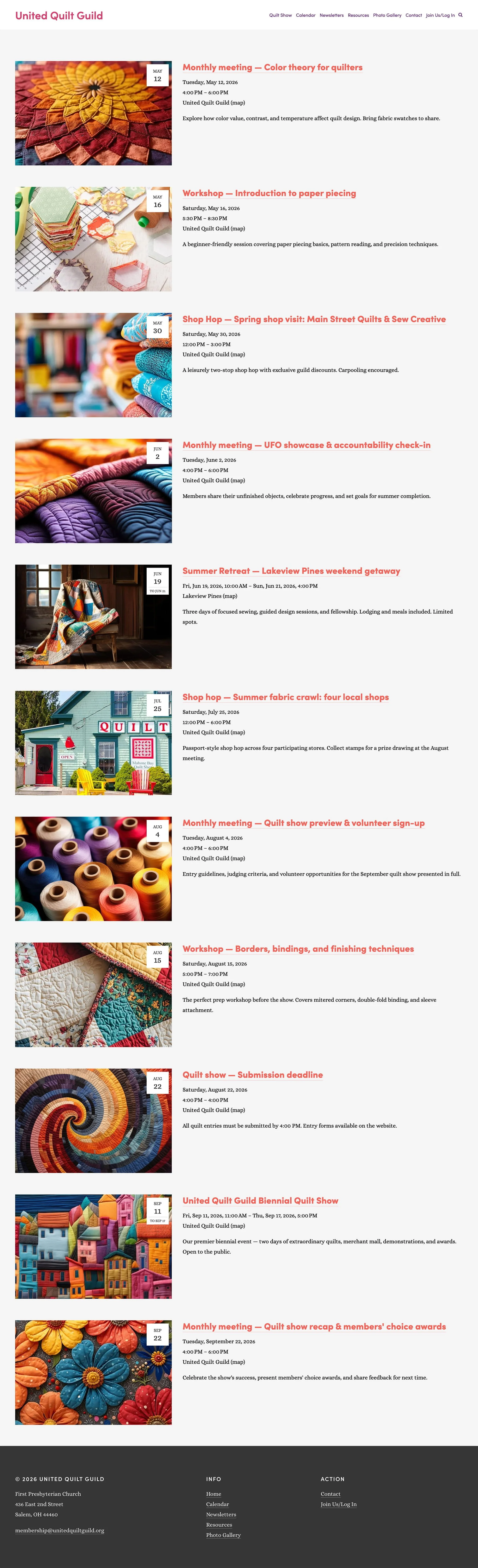
Elevating the Quilt Show: The biennial quilt show is the guild's marquee moment, a major public-facing event that draws attention from well outside the membership. It needed its own dedicated section of the site, one that could serve as a real promotional hub when the show was approaching and sit gracefully in the background during off years. It couldn't be buried in a general events page or treated as just another calendar item.
The Audience-First Design Decisions
Every layout choice, every label, every navigation item was run through one question: can a member who isn't comfortable with technology find this on her own, without help?
That question produced a set of deliberate decisions that went against the grain of a lot of contemporary web design:
Plain, familiar language: Navigation labels are exactly what they say. No clever names, no industry jargon, no labels that make you think before you click. If it's the events page, it says "Events." If it's for new members, it says "Join Us." The guild's own vernacular — the words their members actually use — was woven throughout, so nothing felt foreign.
Large, clear navigation and text: Nothing small, nothing subtle. Text is sized for comfortable reading, and the navigation is prominent and immediately legible, whether you're on a desktop at home or a tablet on the couch.
High contrast throughout: Color choices were made with readability as a non-negotiable, not an afterthought. Content is easy to read in any lighting condition, on any screen.
Uncluttered page layouts: Each page has a clear focus and breathing room around it. Nothing competes for attention. The instinct to fill space was resisted at every turn, because for this audience, a cleaner page is always a more usable one.
The Solution
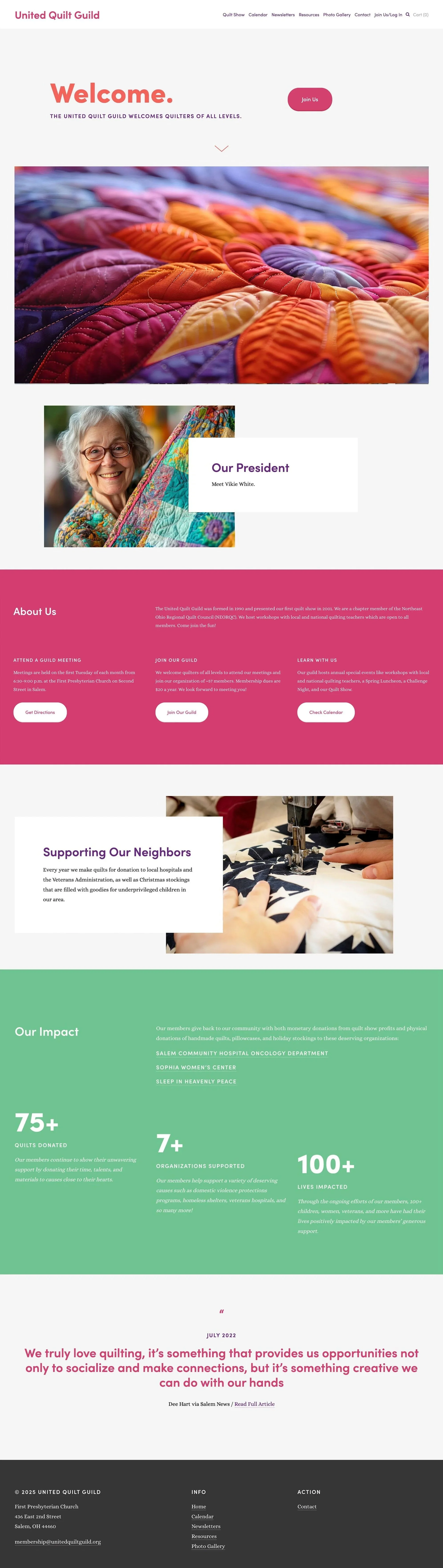
The finished product is a warm, welcoming, and (most importantly) reliable Squarespace website built specifically for the United Quilt Guild community.
The aesthetic is playful and crafty without being cluttered: a site that feels like it belongs to a group of people who make beautiful things and want you to know it, while still being easy to navigate for someone who just wants to find out when the next meeting is.
Every section has a clear home and a clear purpose. The events calendar covers monthly meetings and classes in a consistent, predictable format. The Quilt Show has its own dedicated section, ready to become a full promotional hub in show years. The archive and gallery are organized into a browsable system that honors the guild's history rather than hiding it. The member resources area gives existing members a reliable destination for the things they need regularly. And the new member information gives curious visitors a clear, welcoming path to joining.
The entire site was built on Squarespace, chosen deliberately for this project because it gives volunteer maintainers a straightforward, visual editing experience that doesn't require any technical knowledge to use. Paired with the style guide and maintenance documentation delivered at handoff, the guild now has not just a better website, but a sustainable one.
The Result
United Quilt Guild now has a website that works, and keeps working. The days of malfunctioning pages, frustrated members, and emergency volunteer patch jobs are behind them. In their place is an organized, accessible, and genuinely usable digital home for a community that has always deserved one.
Every decision made in this project, from the architecture to the font size to the words on the buttons, was made in service of the people actually using it. That's what good website strategy looks like when the audience is the brief.
Building something for a community or membership organization? I'd love to help. Let's talk.
Additional Pages