Vellichor Event Planning
Custom Website & Brand Identity
The Client
Vellichor Events is a wedding planning company with a genuine eye for beauty and a reputation built on delivering exceptional, personal experiences. By the time Vel came to me, she had already been in business long enough to have a professional website, but that site had quietly become her biggest obstacle.
She wasn't a new planner trying to get noticed. She was an experienced one, ready to move upmarket, attract higher-budget clients, and position herself firmly in the luxury wedding space. The problem was that nothing about her online presence said that.
The Problem
Her existing site wasn't bad, it just wasn't her anymore. Or rather, it wasn't who she was becoming. It had the bones of a professional site, but it lacked the visual language of a luxury brand. There was nothing about it that signaled premium. Nothing that made an upscale couple land on the page and think, yes, this is exactly the kind of planner we're looking for.
In a market where couples are making deeply emotional, high-investment decisions, your website isn't just a portfolio, it's a first impression, a trust signal, and a conversion tool all at once. Hers was struggling to convey that.
She was ready to raise the bar. The brand just needed to catch up.
The Goal
The brief was clear: attract a more premium, luxury-market clientele. But behind that goal was a more specific challenge. Build a website that didn't just look elevated, but one that actively guided the right couples from first click to inquiry. More bookings, better-fit clients, a brand that reflected the quality of the experience she was already delivering.
My Process
Getting this right meant doing the strategic work before touching a single design element.
Discovery: We started with a deep-dive brand questionnaire. I needed to understand not just her aesthetic preferences, but her ideal client, what made her different from other planners in her market, and what she wanted couples to feel when they landed on her site. That foundation shapes every decision that comes after.
Market & Competitor Research: I looked at where she sat within the luxury wedding planning space and where there was room to stand out. Luxury is a crowded lane, the goal wasn't to look like everyone else doing it, but to carve out a visual identity that was distinctly Vellichor Events.
Moodboarding: Before any design work began, I built out a visual direction and got her aligned on it. This step saves enormous time and prevents the back-and-forth that happens when a client sees a logo concept and realizes it's not the direction they imagined. We agreed on the vision first.
Website Strategy Session: This is where the site stopped being a design project and became a business tool. We mapped out the full site structure, content priorities, and — critically — the specific path a visitor needed to travel to become an inquiry. Every page was given a defined purpose within that journey.
The Website Strategy
Good design gets attention. Good strategy converts it.
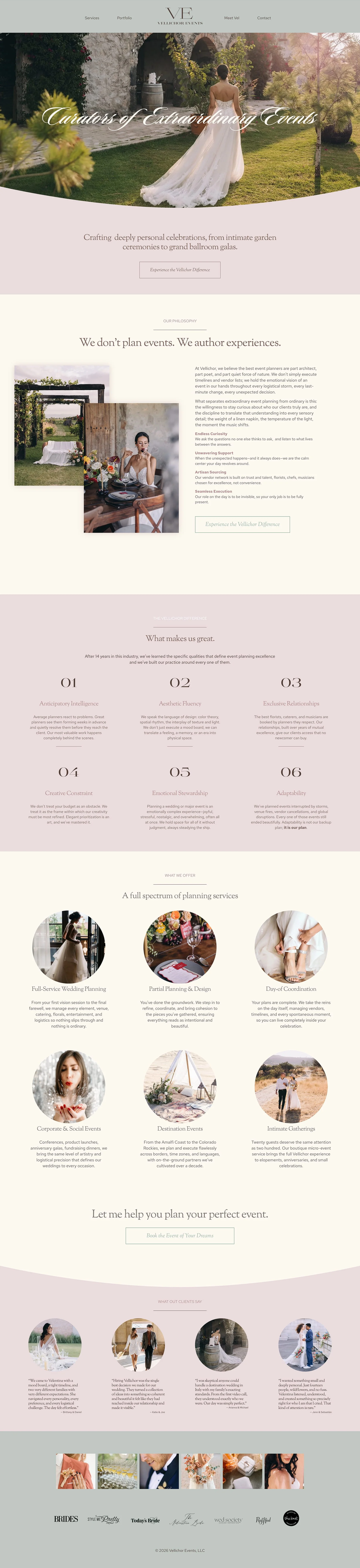
The site was built around a deliberate, intentional visitor journey: Homepage with Services Overview → Portfolio → Contact. That sequence wasn't arbitrary, it mirrors exactly how a luxury wedding client makes a decision.
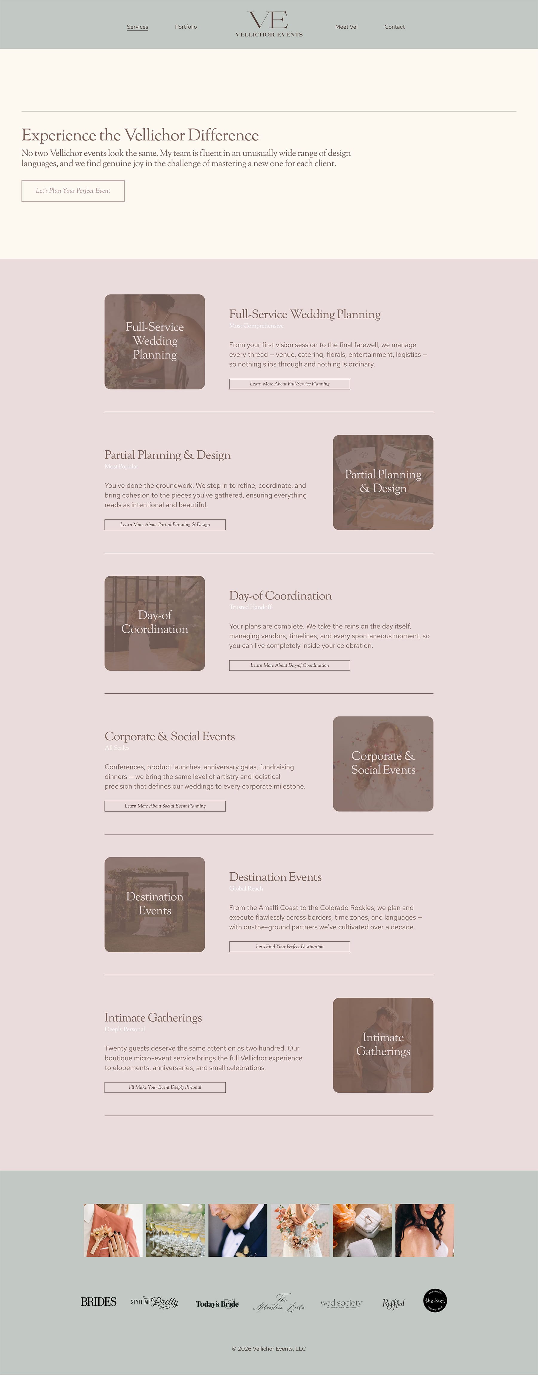
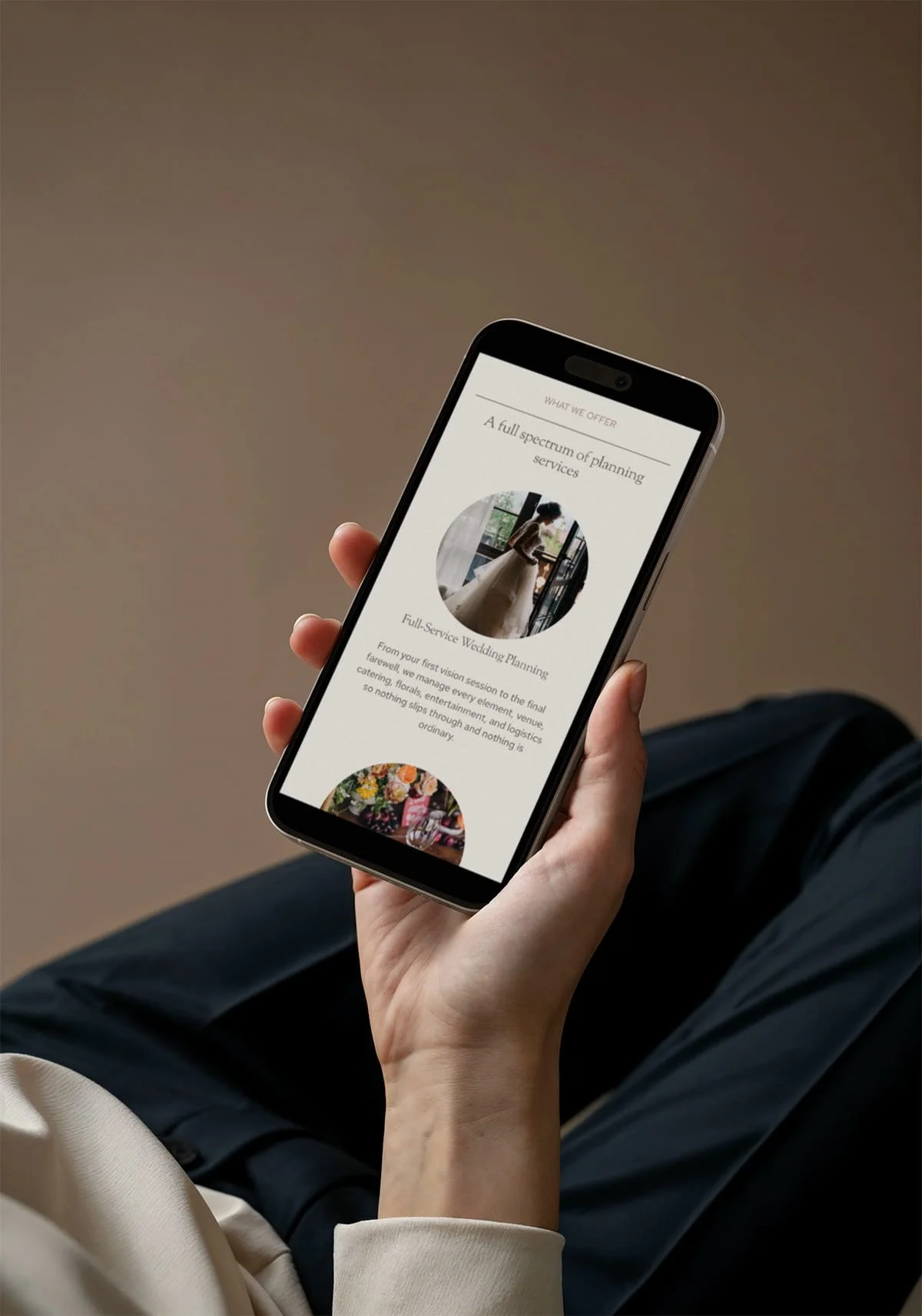
Homepage: The first job of the homepage was to make an immediate impression. A visitor needed to land on it and know, within seconds, that they were in the right place, that this was a planner who operated at a certain level and delivered on a range of unique events. The homepage established that, then gave them a clear, compelling reason to keep exploring.
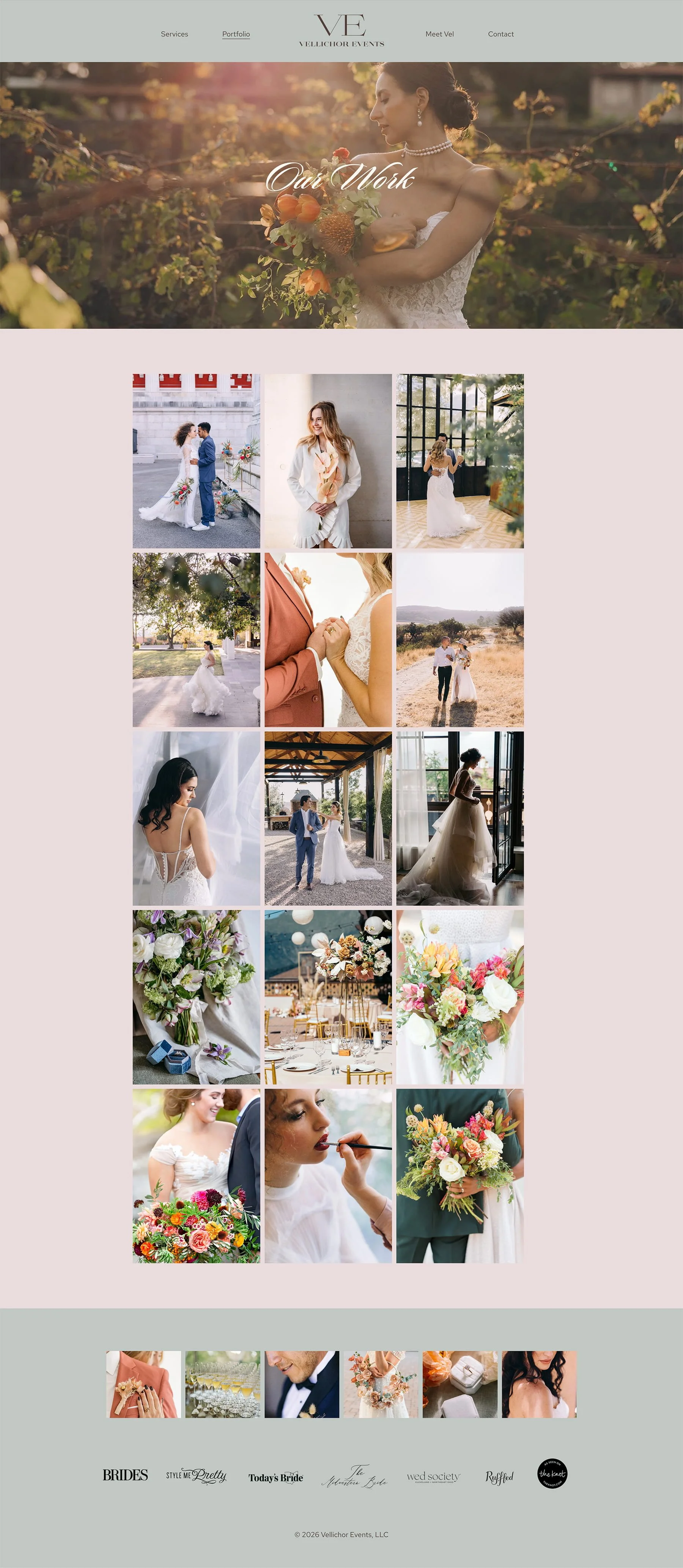
Portfolio: The portfolio page did the heaviest lifting in the conversion journey. This was a deliberate choice. By placing her best work front and center before asking anything of the visitor, the site let her results speak for themselves. Couples browsing her portfolio weren't just looking at pretty photos — they were building desire, imagining their own day, and warming up to the idea of reaching out. By the time they moved to the next page, the selling was largely done.
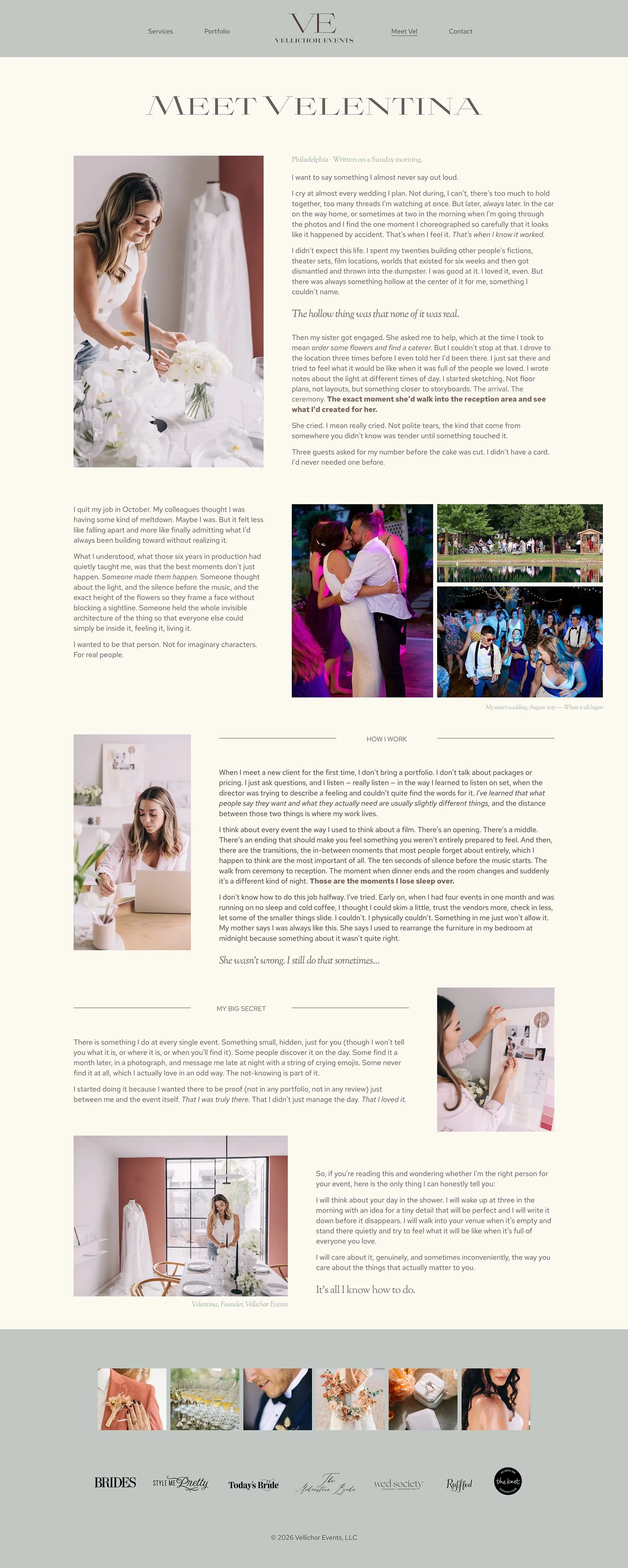
About Page: Wedding planning is an intimate business. Couples spend months (sometimes over a year) working closely with their planner. They don't just hire a vendor; they choose a person. The about page was designed to build exactly that kind of personal connection and trust, so that by the time a visitor reached the contact page, they already felt like they knew her.
Contact & Inquiry Page: A dedicated, friction-free inquiry page with one job: make it easy to reach out. No distractions, no buried forms, no dead ends. Just a clear next step for couples who were ready.
Throughout the entire site, strategic calls-to-action guided visitors forward at every stage, so no one ever landed on a page and wondered what to do next.
The Design Challenge
The trickiest part of this project had nothing to do with the logo or the color palette, it was the tension at the heart of luxury wedding branding. Elevated design can easily tip cold. And cold doesn't book weddings.
The couples Vellichor Events wants to attract need to feel something when they land on that site: warmth, excitement, trust, the sense that this planner gets them. But the brand also needed to signal a premium experience, not just a pretty one. Threading that needle, sophisticated and warm, minimal and inviting, was the central design challenge throughout.
The Solution
The deliverable was a full brand identity and a custom Squarespace website, built to work together as a unified system.
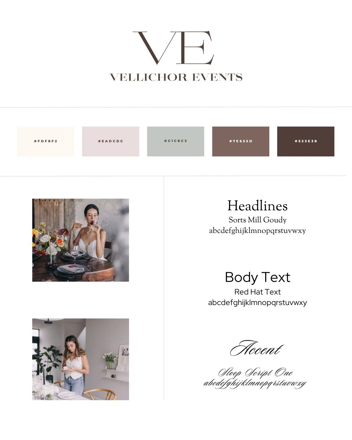
Brand Identity: The new brand identity included a custom logo, a refined color palette, a curated typography system, and a complete set of brand guidelines she can use consistently across every touchpoint, from her website to her proposals to her social media.
The aesthetic direction was elegant and minimal. A neutral palette, clean and considered typography, and intentional white space gave the brand room to breathe and let her portfolio photography take center stage. Nothing competed with her work, everything framed it.
Squarespace Website: The full site was designed and built on Squarespace, the platform I specialize in exclusively. Squarespace was the right choice here for several reasons: it's polished and design-forward out of the box, it's built to handle beautiful photography-heavy sites, and critically, it gives clients like her the ability to manage and update their own content independently without needing a developer every time something needs to change. She walks away with a stunning site and the confidence to maintain it.
The Result
Every decision made in this project, from the brand direction to the page structure to the placement of a call-to-action button, was made with one outcome in mind: more bookings from better-fit clients.
Vellichor Events now has a brand and a website that do what they're supposed to do. They position her where she wants to be, speak directly to the couples she wants to attract, and guide those couples toward reaching out. The gap between the experience she delivers and the impression she makes online? Closed.
Interested in a custom Squarespace website and branding that works as hard as you do? Let's talk.
Additional Pages